Design your next
Dream Room
Sign in or create a Graham & Brown account to add products to your wish list and get started on transforming your space.


.jpg?crop=3:4&width=900&quality=85&auto=webp)


.jpg?crop=3:4&width=900&quality=85&auto=webp)

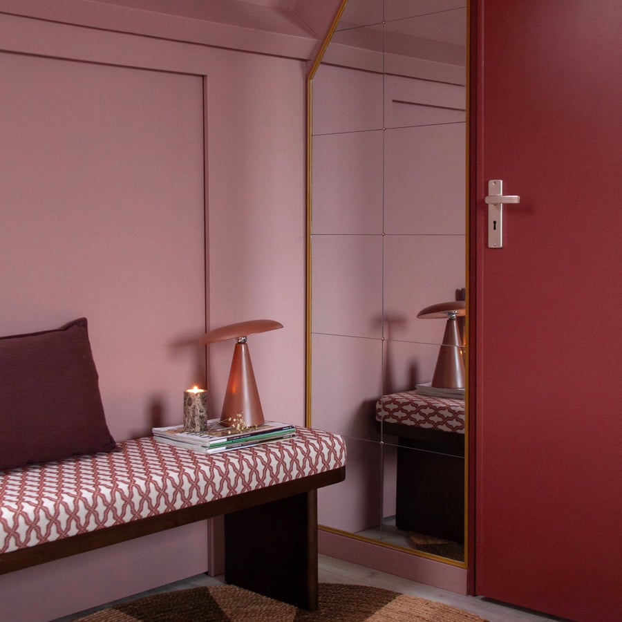
Colour capping
Colour drenching has shaped the way we’ve decorated for the past few years, wrapping rooms in a single, immersive shade from wall to ceiling. Now there’s an elevated take on the idea, one of the most considered paint trends we’ve seen in a while: colour capping.
Rather than committing a whole space to one colour, colour capping layers two or more tones from the same family, so the colour shifts gently as it moves up the wall. It keeps all the enveloping warmth of drenching, but adds depth, dimension and a quietly sophisticated finish. Here’s how it works, and how to use it in your own space.
Colour capping is a tonal painting technique that finally gives the ceiling ~ so often left plain white ~ its due. Instead of stopping the colour at the top of the wall, you carry a related shade up and over, ‘capping’ the room from above. The two tones sit one above the other in a soft gradient, drawing the eye upward and making the whole space feel warmer, cosier and more considered.
It sits neatly between two looks you’ll already know. Where colour drenching uses a single shade everywhere and colour blocking pairs contrasting colours in graphic blocks, capping stays within one colour family and shifts gently between tones. The effect is subtler and more polished.
If colour drenching was the bold opening statement, capping is its more refined next chapter. It delivers the same immersive impact, but with a layered, tonal quality that feels distinctly high-end.
“Colour capping is the perfect way to pair red and pink together. It creates a tonal escalation within the same colour family and offers a subtle evolution from full colour-drenching.”
– Paula Taylor, Stylist at Graham & Brown
It also reflects a broader shift in the way we’re decorating. After several years of minimalist neutrals and greys, there’s a real appetite for joyful, expressive colour, and capping is a considered way to embrace it ~ delivering the drama of a feature wall in a more grown-up, sophisticated way.
The pairing at the heart of this trend is red and pink: a combination once considered daring, and now thoroughly embraced. Because pink is, a softer expression of red, the two belong to the same colour family, which makes them natural partners for a tonal, capped scheme.
“Used together, pink and red create a cocooning, immersive effect, with continuous tones that wrap the space. The result is a high-end look, delivering the impact of a feature wall in a more sophisticated way. The tonal shift between pink and red works beautifully in living rooms and bedrooms, creating spaces that feel both chic and calming.”
– Paula Taylor, Stylist at Graham & Brown
The result is a room that feels enveloping and warm, but never overwhelming. The gentle escalation from dusky pink to deep red gives you all the richness of a bold scheme, with a softness that keeps it calm.
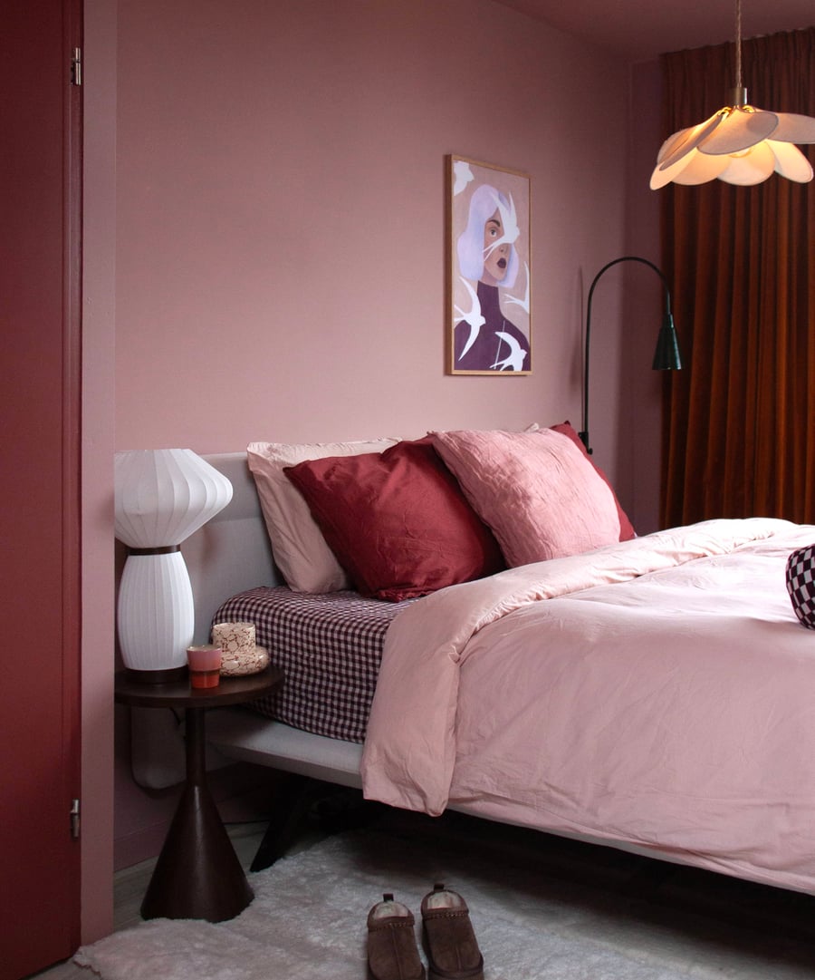
The beauty of colour capping is how achievable it is. Start by choosing two tones from the same family, one deeper and one softer. As a rule, the softer shade ‘caps’ the room ~ carried across the ceiling and often down to a picture rail or the top of the wall ~ while the richer tone sits below, though the look works just as well in reverse.
A few pointers for a polished finish: keep your two shades within the same colour story so the transition feels seamless rather than stark; decide where your line will sit before you begin, as a picture rail, if you have one, makes a natural break; and consider picking out woodwork in a hard-wearing eggshell to frame the scheme.
For a red that caps a scheme with real depth, reach for Roger Red, a classic, confident red; Barolo, a rich shade with the depth of a fine wine; or Alizarin, a warm, characterful crimson. Pair any of these with a dusky pink below: the soft, heathery Highland Rose, the gentle Rose Angel, or the warm, blushing Munchkins Nose. Together they make a perfect mix of dusky pinks and bold reds ~ a considered way to make a statement at home.
Explore the full range of red and pink paints to find your own tonal pairing, and order samples of both so you can see exactly how the shades escalate in your own light.
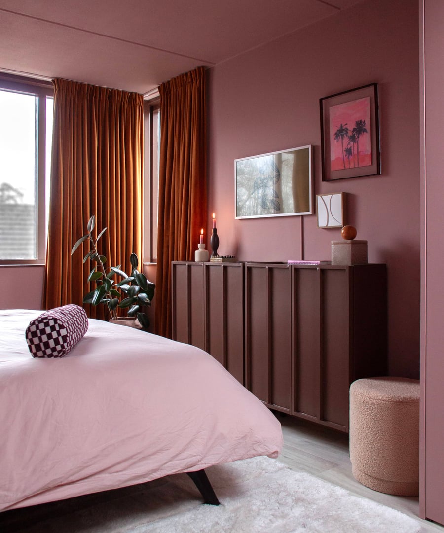
As Paula suggests, colour capping is especially lovely in the rooms you’d like to feel warm and enveloping. In a living room, the tonal wrap of colour creates a sociable, cocooning backdrop for evenings in. In a bedroom, the same effect feels restful and quietly sophisticated, drawing the eye up and making the space feel both warmer and more intimate. It’s a look that’s equal parts chic and calming.
This elevated finish is a considered way to bring colour into a room. Choose two tones you love, decide where the colour should sit, and enjoy the depth and warmth it brings. To carry the scheme through, echo your tones in soft furnishings and wall art, so the room feels cohesive from floor to ceiling. Explore our new Decorating Tools, our premium range is designed to help you get the best results with colour capping.
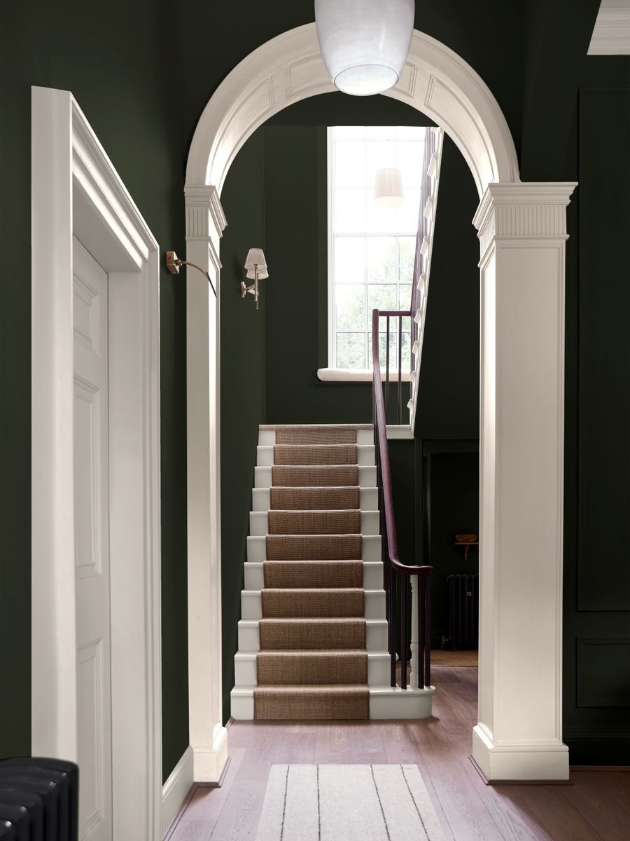

Turn any house into a home with Graham & Brown's premium quality interior wall paint. Designed to go on smoothly and dry in around two hours to a flawless finish.
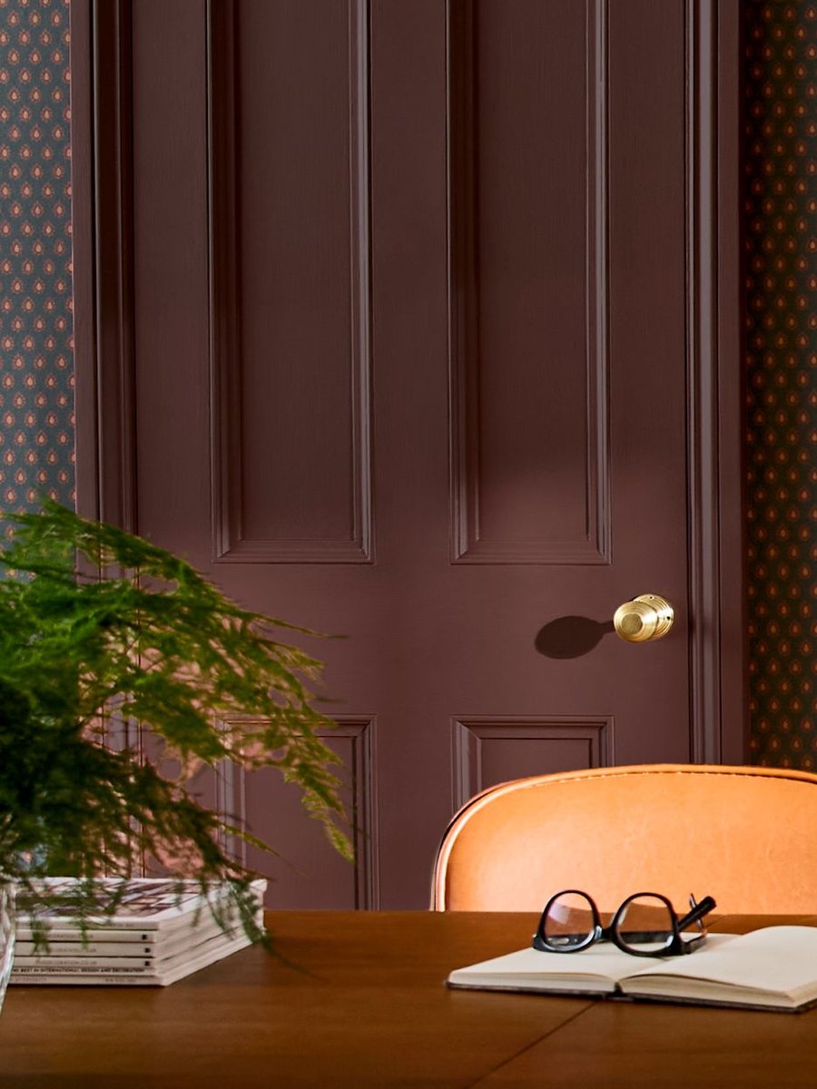
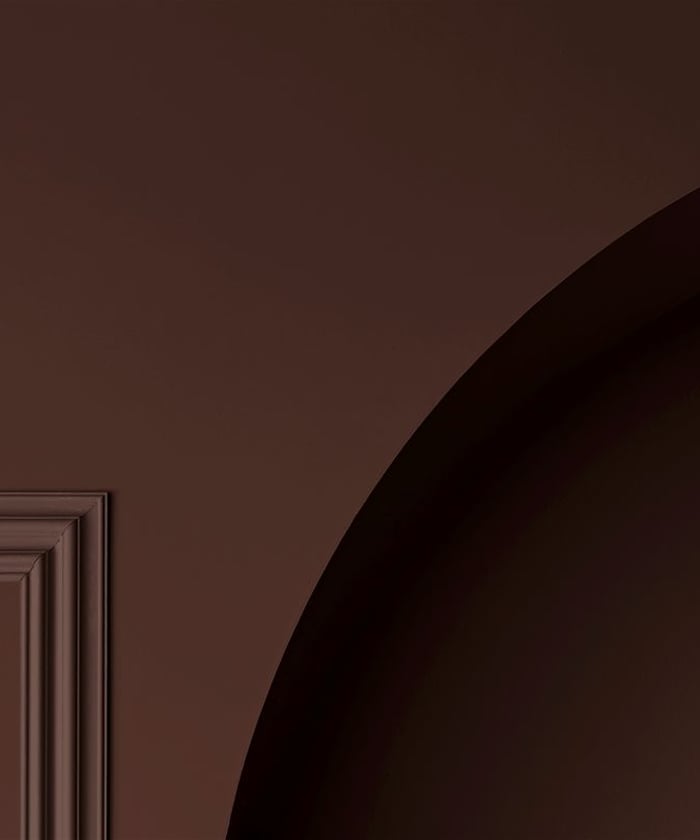
Subtle details can turn a plain interior into something special. That's why our interior wood paint is the perfect partner for your Graham & Brown wallpaper, murals and paint.
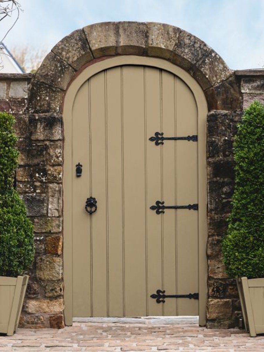
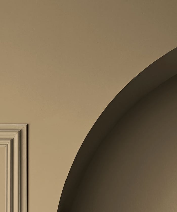
Protect and brighten your fences, doors and window frames with exterior wood paint from Graham & Brown. This selection of beautiful colours is for use on all types of exterior wood.


It's the little touches that complete a look, and with Graham & Brown's designer interior metal paint, you can finish metal furniture and frames to perfection.
.jpg&w=100&q=75)