
Home Decor
Discover ten neutral home décor ideas to bring calm and character to your space. From monochrome shades to natural textures, here’s how to create a home that feels considered, restful and wholly your own.
Subtle and understated has a quiet confidence. A neutral scheme invites you to work with gentle tones, natural light and texture, layering them into a space that feels calm, grounded and welcoming. And don’t mistake neutral for plain – the palette is wonderfully broad. Greys warmed with red or cooled with blue, the palest sage, soft off-whites, golden beige: there’s a version of neutral to suit every home and every quality of light.
Because neutrals reflect rather than absorb, they let daylight travel further, lifting even the shadowy corners of a room. They’re generous, too, pairing easily with other colours, patterns and textures to create restful bedrooms, inviting living rooms and sophisticated kitchens. Below, we’ll walk you through the neutral ideas we return to time and again – and where each one tends to work best.
Forget ‘magnolia with everything’. A neutral scheme can hold far more than that: earthy, grounding tones, the soft gleam of metallics, the tactile weave of natural Grasscloth, gentle pastels and considered greys. Used with a little care, neutral is anything but quiet.
What follows are several combinations that bring light and life into a home, along with a few thoughts on where each tends to shine. Before you settle on a favourite, it’s worth pausing to notice how much natural light a room enjoys and what furnishings you’re already working with – the best schemes nearly always start with what’s already there.

White-on-white sits at the purest end of the neutral spectrum, and there’s far more to it than first meets the eye. The secret is texture and pattern. A bold design rendered in the softest of tones – like the grand Gothic Damask Flock White Wallpaper – makes its presence felt without overwhelming a room. It’s the faintest suggestion of a pattern that draws the eye, breaking up the white so your space feels considered rather than clinical.
Some of the loveliest neutrals come straight from nature. Warm browns and ochres have a way of grounding a room, bringing a calm that suits living spaces beautifully – whether as an accent or wrapped across all four walls. The understated brown of Albion Texture Neutral Wallpaper is a natural fit for a relaxed, sophisticated living area, especially alongside soft greys. Look closely and you’ll see the textured finish at work, catching the light and scattering it for a gently organic effect.


Monochrome is often the language of pared-back, modernist interiors, and the play of dark against light brings a real sense of sophistication. Take the Rivington Folly Tattoo Bespoke Mural, portraying a charming arboretum scene of historic man-made rockwork, creating a serene and picturesque atmosphere. The intricate details and skilled artistry make it a standout piece.
One of the joys of a neutral scheme is how easily it makes space for a bolder gesture. A touch of metallic brings light and movement, and set against a single, quiet backdrop it lends a room a real sense of occasion. The Boreas Teal & Silver Wallpaper shows it perfectly: a deep teal ground brought to life by a silver twig-and-bud motif. It’s a Japanese-inspired design with a thoroughly modern twist – simple, but quietly striking.


Texture gives a plain colour a third dimension, working with the light to add depth and interest. It’s a wonderful way to bring warmth to a hallway or make a spare room feel genuinely homely. There’s a practical upside, too: a textured finish is forgiving of an imperfect surface, which makes something like Grasscloth Natural Wallpaper a thoughtful choice for an older home with a little history in its walls.
Grey has quietly earned its place as a true interiors staple, and it’s easy to see why once you discover how versatile the palette can be. Think of the subtle undertones – a whisper of pink here, a hint of blue there – soft enough to perfectly partner almost any colour or pattern, with an elegance that lifts a whole room. A grey like Haptic Grey Wallpaper is ideal where a living space needs a contemporary touch. Combining a tactile quality and understated design, and pairing perfectly with our Steel or Indian Ink paint, this palette is perfect if you prefer a minimalist aesthetic.


Beige and cream co-ordinate beautifully together. Together they feel warm, calm and effortlessly elegant – and a little metallic shimmer is all it takes to make the pairing feel truly special. The combination is especially lovely with heritage designs like the Baroque Bead Pearl wallpaper, which carries a hint of French château and a softly classic pattern that suits a living room or bedroom alike.
Pastels open up a whole new direction for neutral décor. If grey and white aren’t for you but you’d rather not go bold, pastels strike a happy balance that works almost anywhere – a kitchen, a child’s room, a living room, a bedroom. They partner generously with other patterns and palettes too, softening a scheme or gently taming brighter shades so nothing feels overdone. A soft blue like Rowing Boat paint has the warmth of a summer sky and lazy days on the water – an evocative choice for just about any room.


To pull a neutral scheme together, don’t overlook the finishing touches. For a sleek, contemporary feel, matching your curtains to your wall colour creates a calm, cohesive living room or bedroom. The softly beautiful Wallace Mist curtains are a lovely example, partnering happily with a wide range of neutral schemes. They’re equally good at balancing a bolder interior, picking up the tones in a mural or feature wall and softening the overall effect.
Now you have a feel for the different neutral directions on offer, here are a few pointers to help you bring it all together with confidence. They apply to any of the combinations above, whichever one you choose.
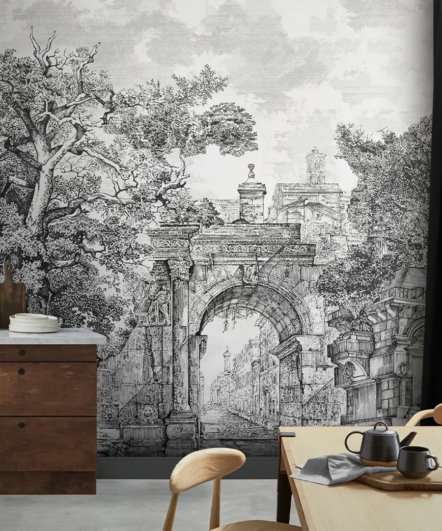
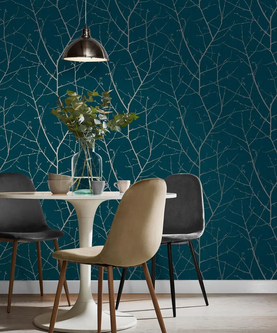
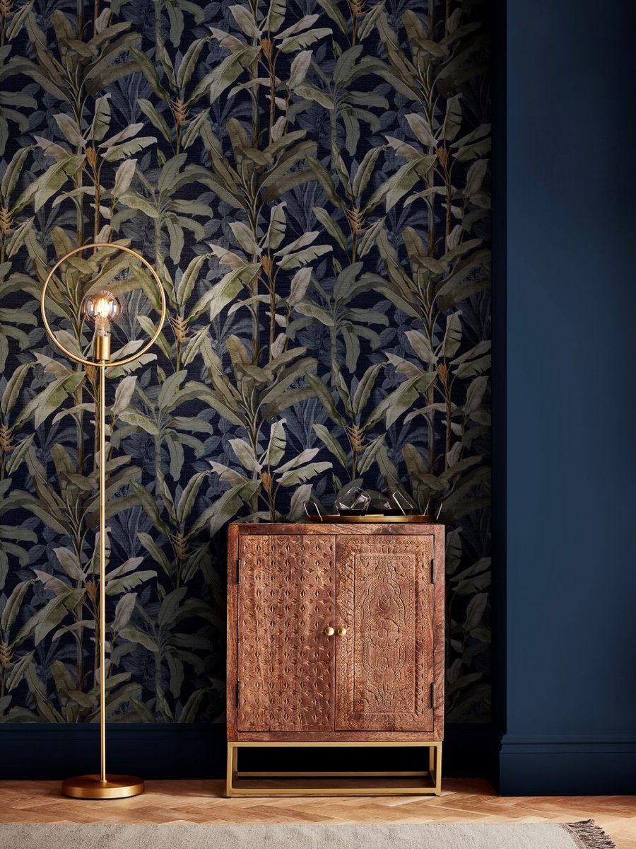
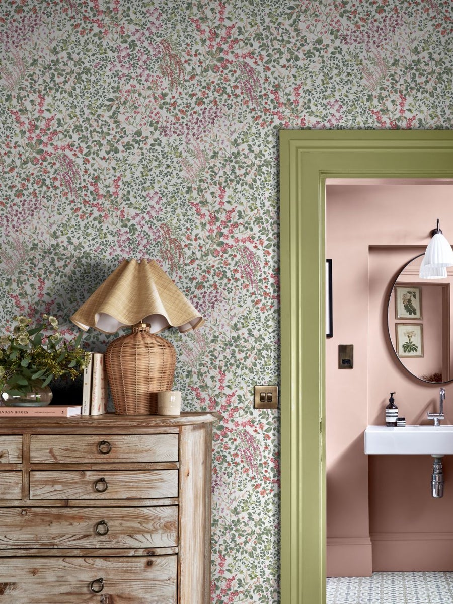
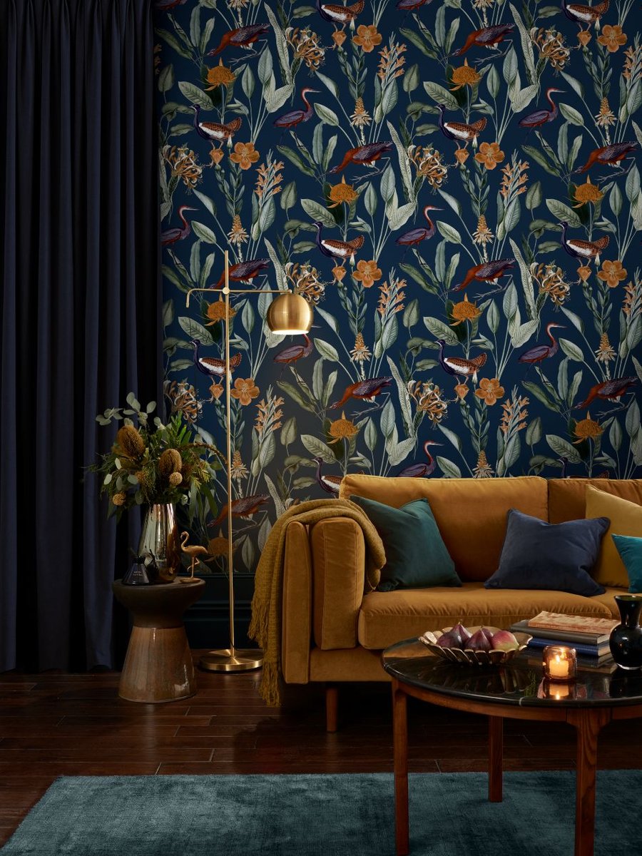
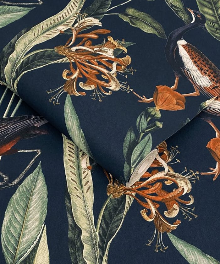
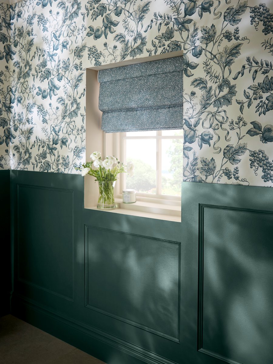
A focal point gives you something to design around, guiding which colours to balance and complement. It might be a window framing a lovely view, a graceful arched alcove, a particular piece of furniture – or a feature wall or mural you want to celebrate.
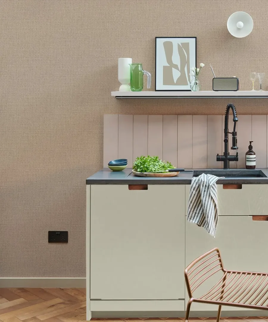
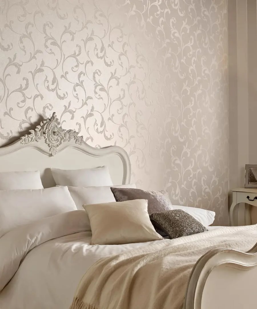
Pastels or metallics? Greys or earthy tones? Now’s the moment to decide. Think about the furniture you already own and how your tones will sit alongside it. Rich wooden floors, for instance, tend to love a warm, earthy palette, while a more contemporary room often welcomes monochrome.
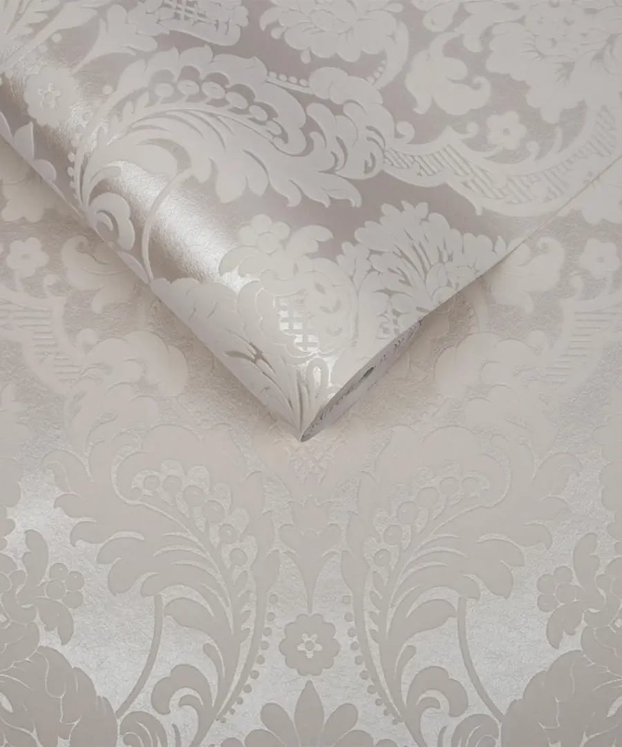
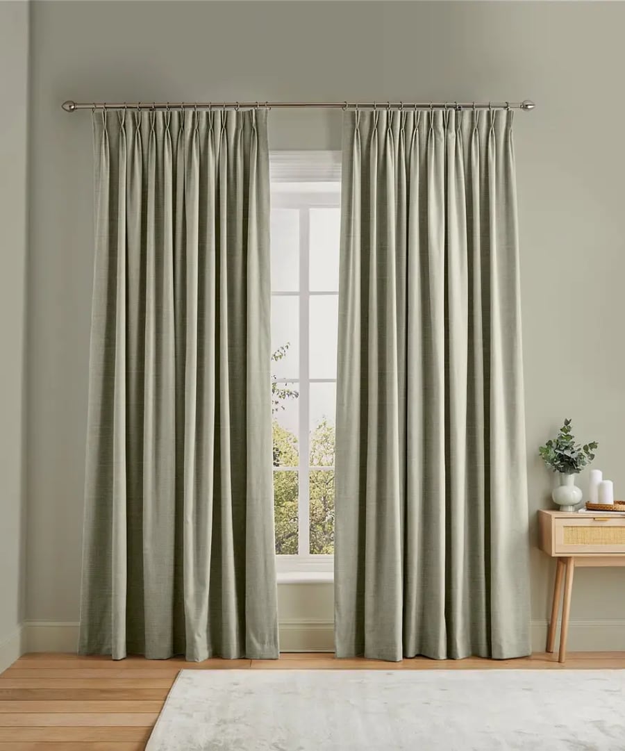
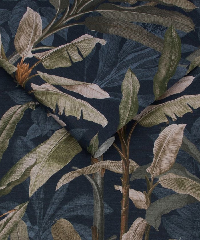
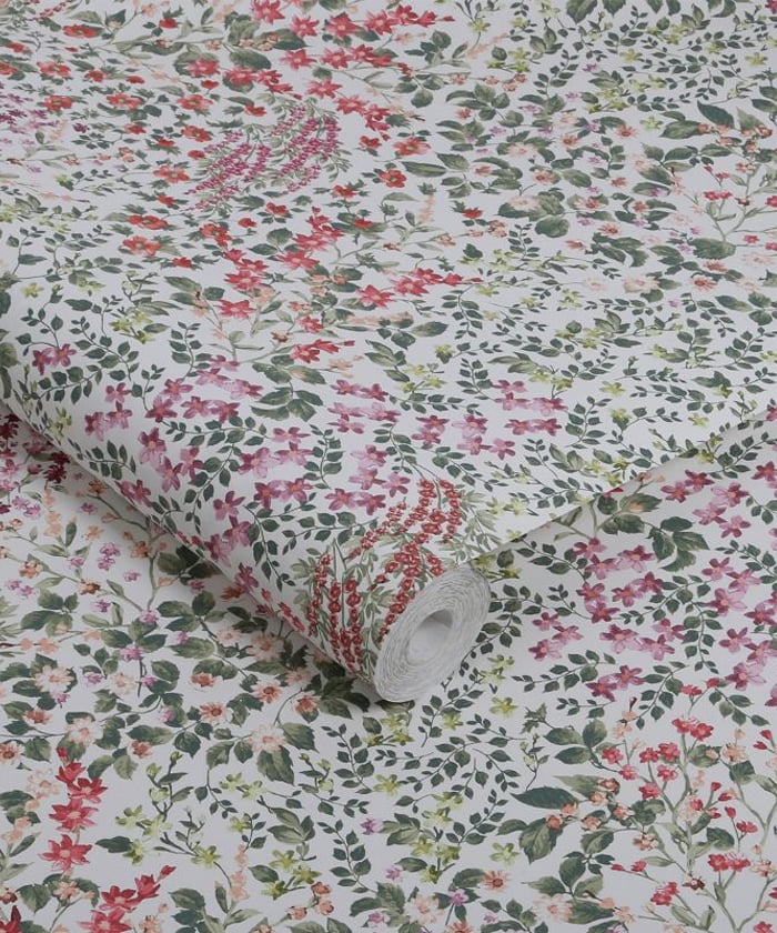
There’s no need to stay on a single note. Within every neutral group sits a whole range of shades to play with – try accenting a deeper grey with a lighter one on the woodwork and skirting, or letting a soft brown meet a richer, more characterful ochre.
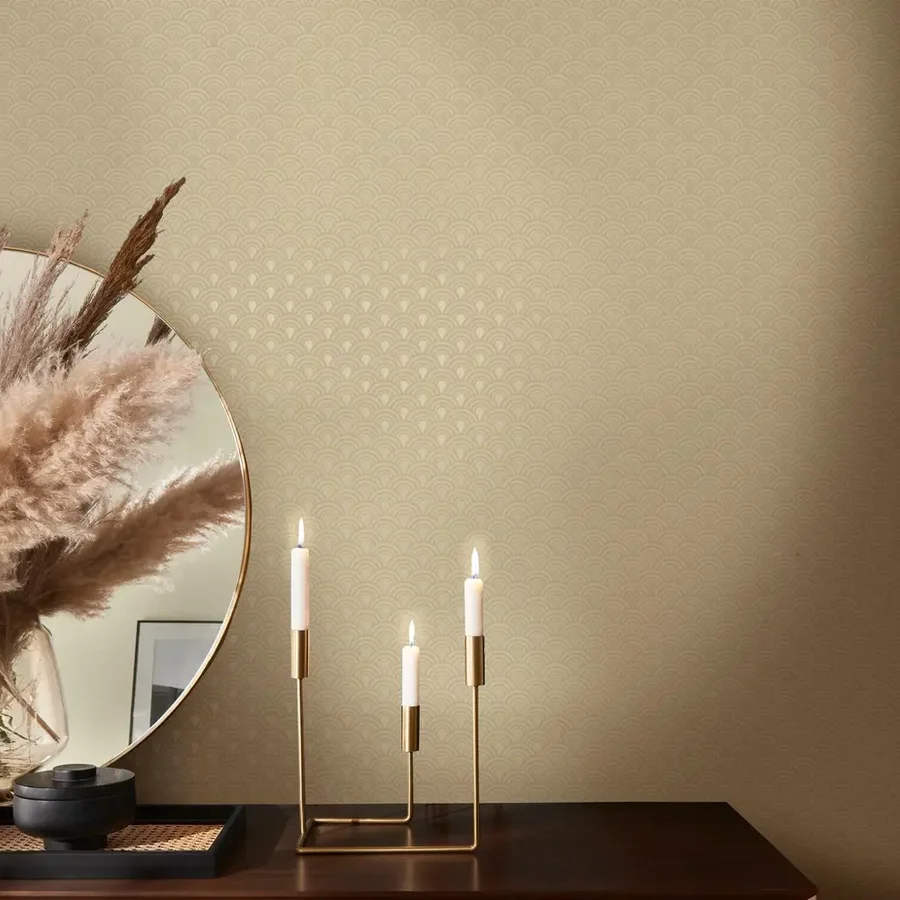
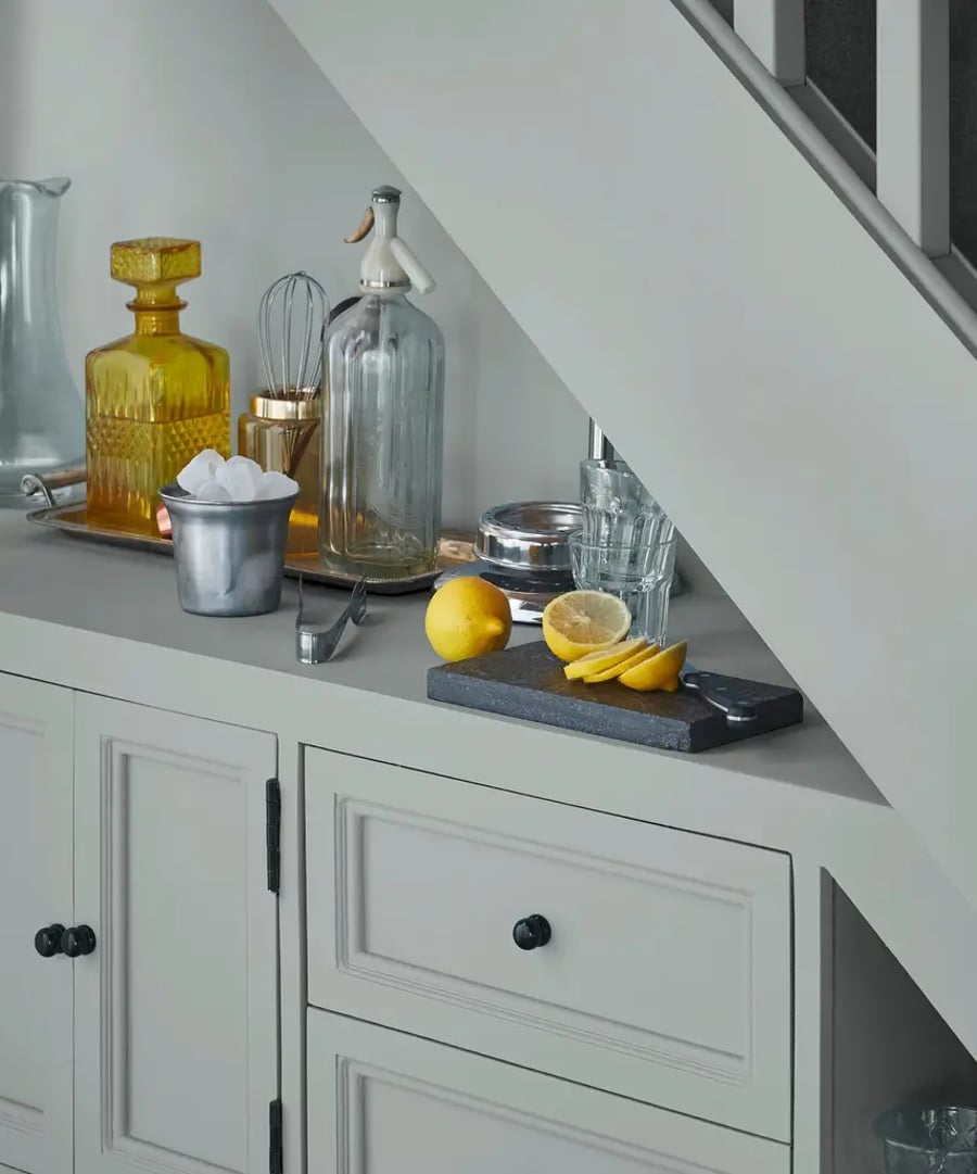
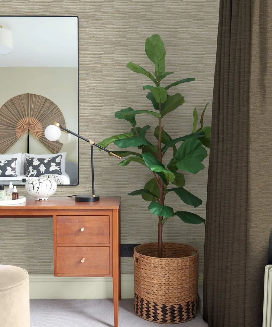
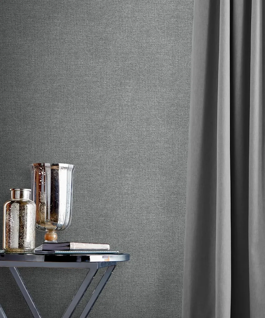
Texture is where a neutral room really comes alive. A little of it stops a scheme feeling flat, letting the light cast soft shadows and bringing a tactile, lived-in quality to a space.
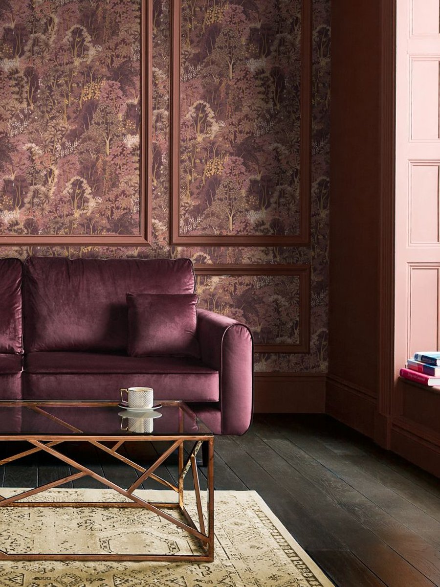
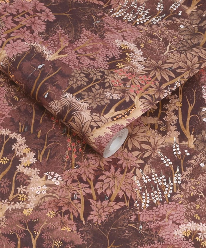
A neutral interior makes the perfect blank canvas. Against it, you can make a space unmistakably yours – a piece of artwork, a scatter of boldly coloured cushions, a patterned rug or curtain. This is your room to express, however you see it.


A celebration of nature, our woodland wallpapers span lush greens and striking monochromes, bringing enduring style with effortless appeal.


Inspired by the outdoors, our botanical wallpapers shift from calming greens to expressive pinks, offering energy, artistry and refined detail.


Rooted in our creative legacy, our floral wallpapers range from gentle pinks to rich greens, offering lasting elegance drawn from the natural world.