Design your next
Dream Room
Sign in or create a Graham & Brown account to add products to your wish list and get started on transforming your space.


.jpg?crop=3:4&width=900&quality=85&auto=webp)

Colour Matching
From calming neutrals to vibrant contrasts, discover which are the perfect colours to go with green and how to apply them effectively to your interior design.
If you’ve decided to redecorate with green and need a little inspiration as to what shade to team it with, then you’ve come to the right place. Surprisingly versatile, this tone works with a variety of different hues. From cool blues, to bold red, we’ve put together the colour pairings that work best to take all the hassle out of deciding which shade to use. Let us guide you through the colours that go with greenand howbest to work them into your décor.
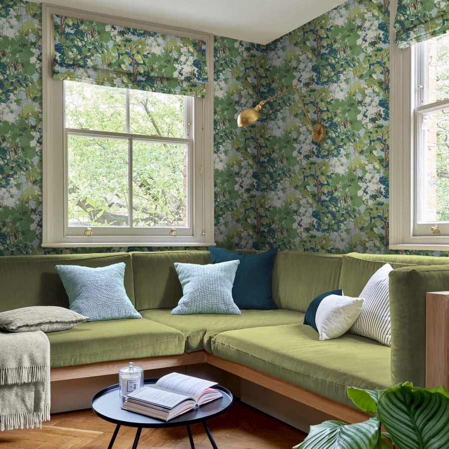
One colour that brings your walls to life. From celery and sage, to emerald and olive, it's bring-the-outdoors-in colours that remains as popular as ever – and it’s easy to see why. Due to its roots in nature, it can evoke feelings of tranquillity, harmony and natural vitality. Plus, it’s simple to work into every room of your home, from the bedroom and kitchen, to the hallway and living room.
Whether you prefer light or dark tones of green, there's a whole spectrum of colours that go with it. If you’re looking for hues to complement or even dramatically clash with the green paints, wallpaper, curtains, or furnishings you’ve chosen, take a look at our suggestions below…
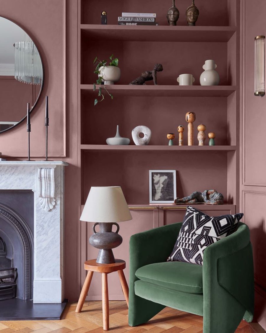
When it comes to colours that go with sage green, other earth tones make a great choice. Matching up soothing, subdued hues, such as chocolate brown, mustard, taupe and beige, with shades of green, creates an inviting palette that brings a sense of warmth and sophisticated elegance to any space. Lighter, pastel green shades can be used as neutrals too and will pair well with a range of other hues, including the warm glow of our Honey Pot paint.
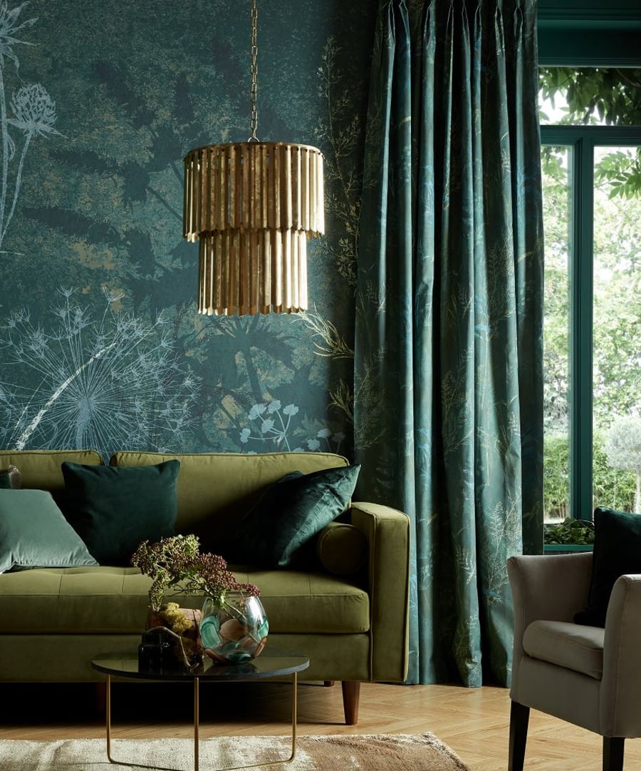
Cool blues Want to create an immediately calming and welcoming space? You can’t go wrong with a green and cool blue colour combination, as our statement Lock and Key wallpaper proves. These two tones also work well to create a bold, bright look in kitchens.
Plan on decorating with green? Combine it with touches of vibrant yellow and neutral walls for the ideal contrast. Not only is it one of the best colours that go with dark green, but adding a pop of eye-catching yellow is an effortless way to make a statement in any room. Complement your green paint or wallpaper by bringing in colour with curtains, cushions and furnishings. It creates a harmonious decorative mix without requiring any major design overhauls.
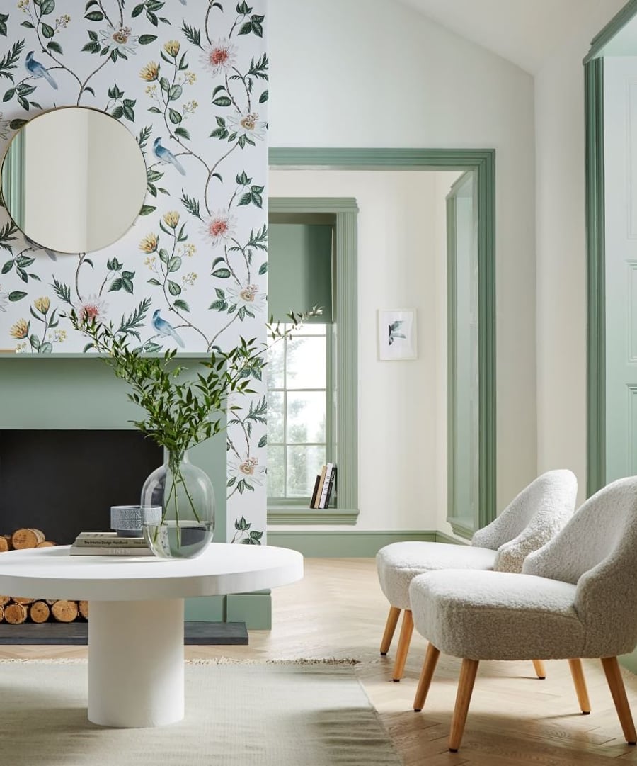
There’s no easier way to enhance the power of green than with white. The timelessness and versatility of white means it works well with all shades, while green puts some punch back into an otherwise understated aesthetic. Proving white is one of those colours that go with olive green, our Summer Fern Lush wallpaper uses the tones to highlight a striking botanical-inspired print. Use it in your living room or hallway to create a calming home
If you’ve decided to change up the look of your home décor, using a luxurious colour combination like green and purple is an excellent way to freshen things up. While it may not be the most obvious pairing when it comes to decorating, it is easily one of the most interesting. Done right, this striking duo makes the most impactful rooms, from the bedroom to your home office. Why not look to our gorgeous purple Malva paint to inspire your next redo? It’s an excellent choice for a feature wall or a colour-blocked wall design.
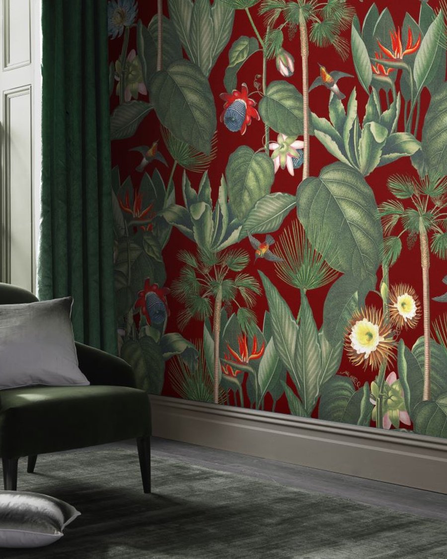
Dynamic green and a super-saturated red hue. Whether your interior is traditional or contemporary, choosing the right tones will ensure it’s warm, welcoming and vibrant. If you want to create a dramatic impression without committing to painted walls, you can achieve a similar look with a wall mural. The next best thing to statement-making art, our Botanique Jungle Rouge mural is made to be noticed thanks to its rich red backdrop, luscious green leaves and cheerful florals.
Generally, green pairs beautifully with almost everything. Yet if you pair it with orange, especially in warm, earthy iterations, you’ll give rooms just the right amount of depth without being too overpowering. It’s the perfect colour palette, if you ask us. Simply can’t decide which shade of orange to use? We’d recommend our Barcelona paint, it mixes hints of red pigment with mainly yellow colourants to form a muted, liveable tone.