


How to Choose the Best Paint Colours
Subtle teal or bold pink? A silky soft eggshell or the deepest matt? Choosing the best paint colours and finishes can make or break an interior. Colours need to not only balance and complement but echo your personality, your style and your preferences.
Subtle teal or bold pink? A silky soft eggshell or the deepest matt? Choosing the best paint colours and finishes can make or break an interior. Colours need to not only balance and complement but echo your personality, your style and your preferences.
The best paint colours create a cohesive, well-designed interior, but how do you choose the right wall colour? What paint trends are big right now, and will you still be in love with that deep mauve or ice-cool blue in a year? Our guide on how to choose the best paint colours will help you navigate your way through the options.
TIPS FOR CHOOSING PAINT COLOURS
Everyone has a favourite colour. But while you may adore bright pink, is it really suitable for an elegant dining room? Will that gorgeously rich, dark navy blue paint work in a small space? Let's start our look at paint colours with a few basic principles.
STICK WITH NEUTRAL SHADES
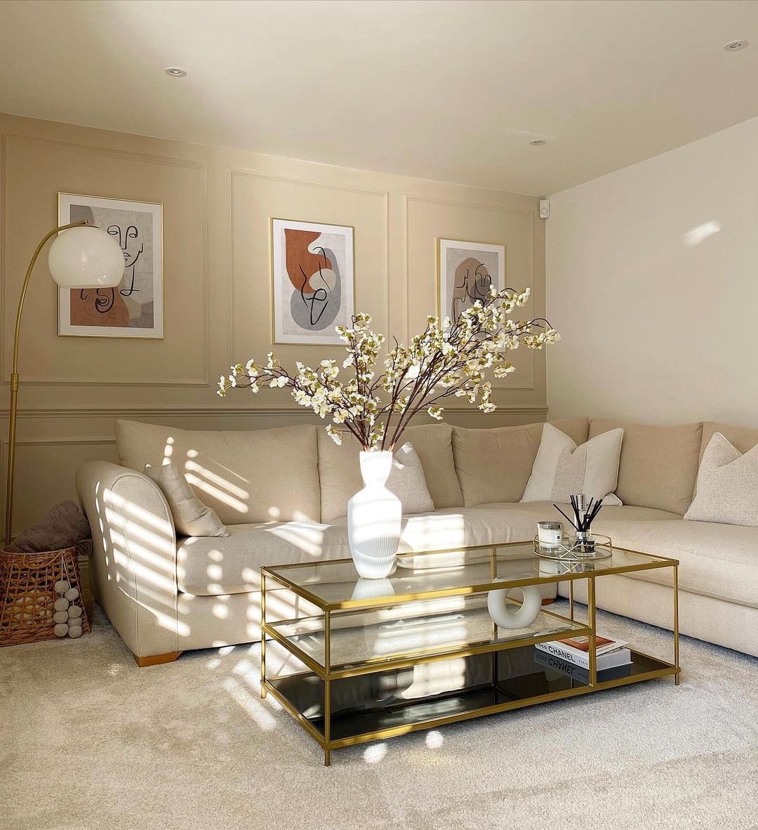
Neutral shades work well with almost any interior, whether it's a contemporary studio apartment or a traditional cottage. Neutral shades don't go out of style, either. They are particularly appropriate if you're planning on selling your property, as they don't alienate potential buyers who may not share your passion for lime green or bright yellow.
A neutral room colour allows you to experiment with pops of colour to liven up the décor using fabrics and textiles, which can be changed seasonally or on a whim without having to redecorate your room entirely. Why not try our Buttercream shade for creating a warm, inviting atmosphere?
PICK COLOURS TO SET A MOOD
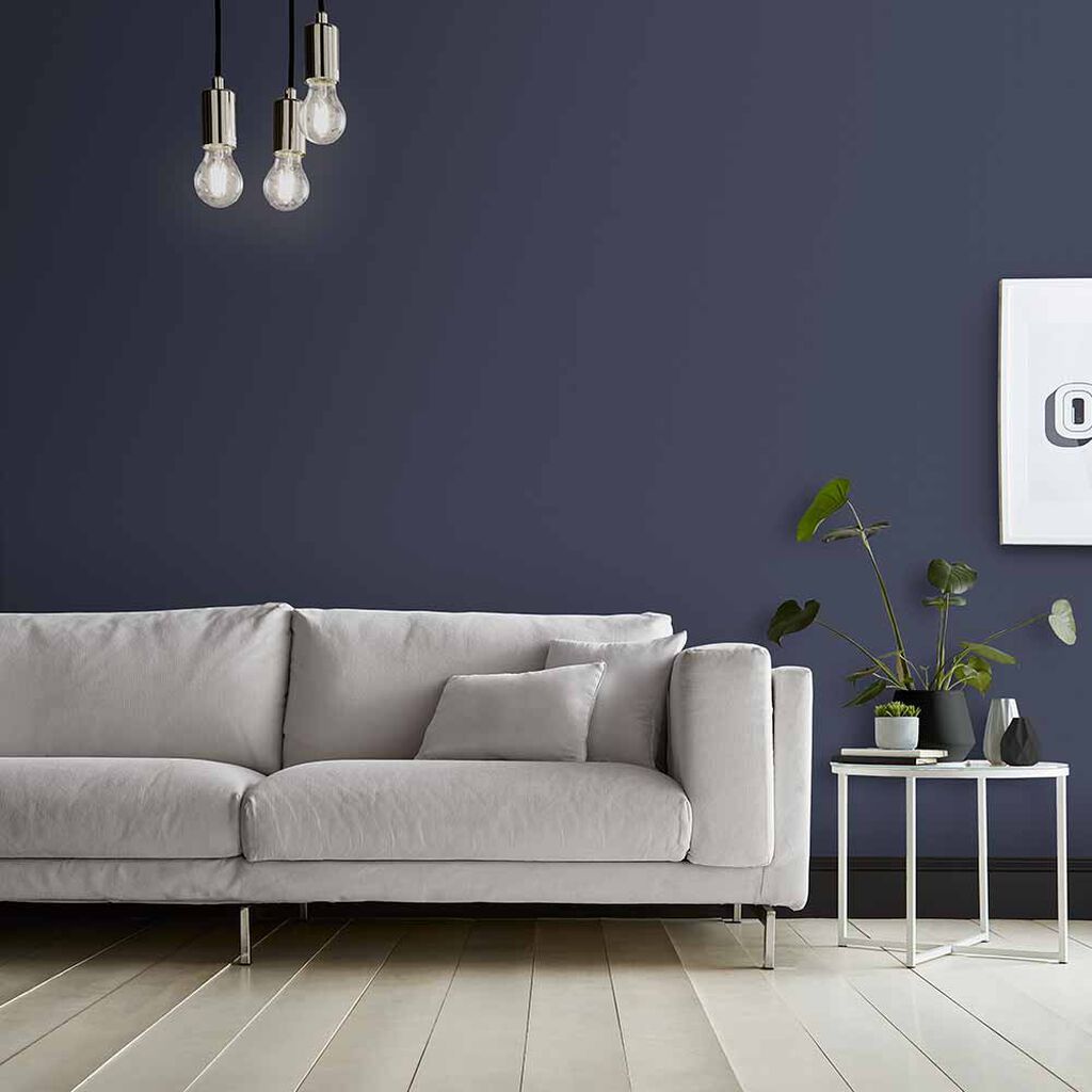
Colours directly affect our mood, so if you want a room to be restful and tranquil, avoid bold colours that stimulate. Mood colours are hardwired into our psychology, so the best paint colours enhance the mood you want rather than fight against it. For example, soft matt blues may feel like ‘cool’ colours, but they can also impart a calm atmosphere that is ideal for a bedroom or living room.
MATCH THE ROOM
What are the best paint colours for specific rooms? That all depends on what the room is used for. Matching the wall colour to the room and its purpose helps to redefine the room’s identity. While there are no hard-and-fast rules about which room colour suits a specific space, some combinations always work well.
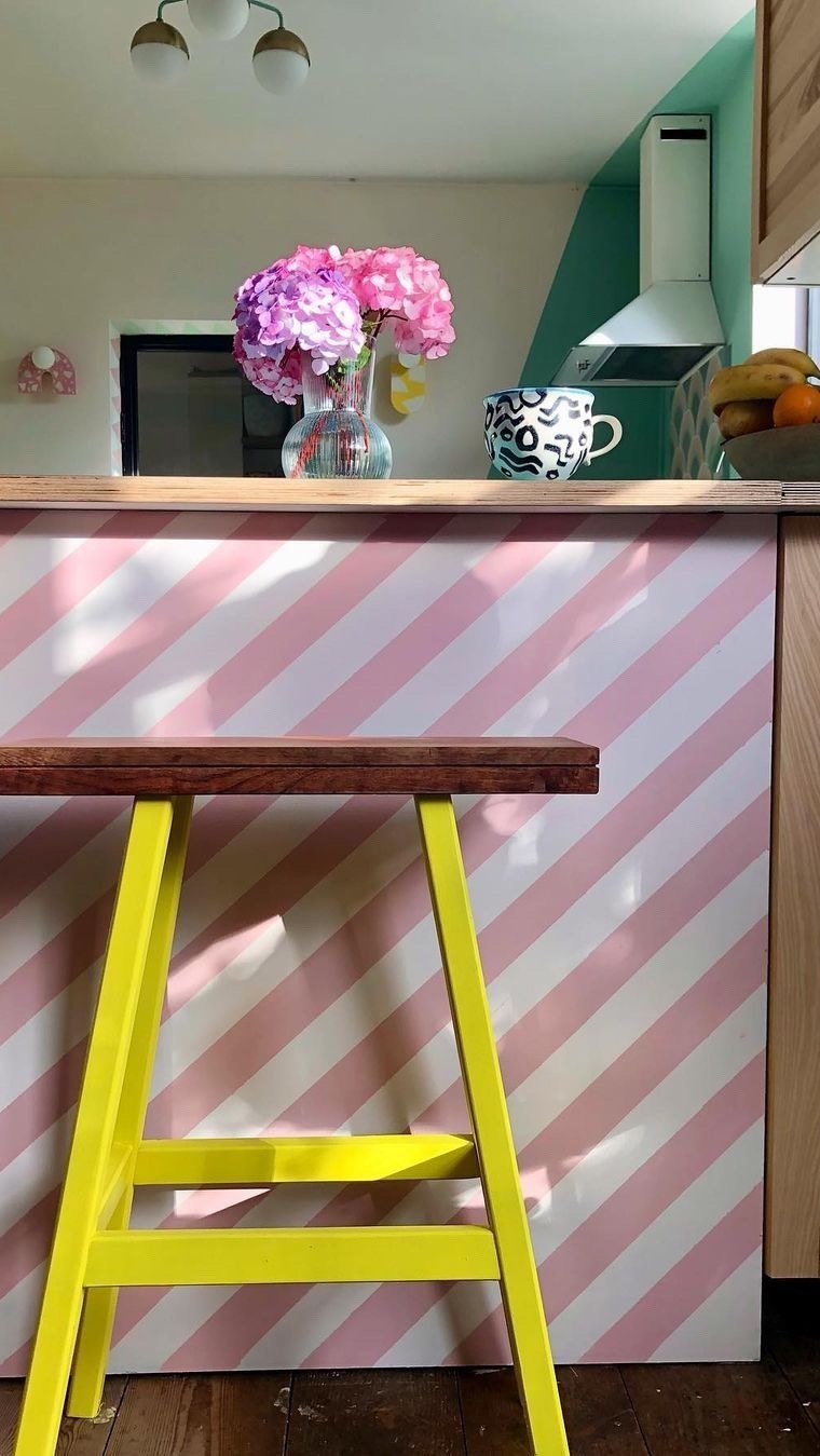
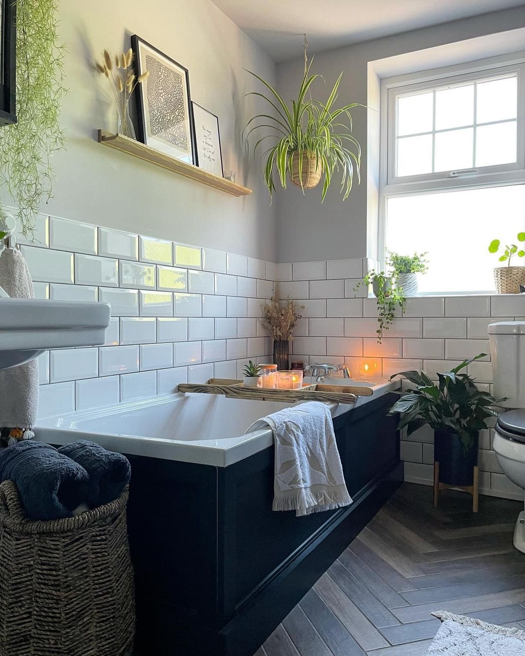
For example, kitchens should be light, bright and airy spaces, so yellows, pastels and even simple white work well and can be complemented by using particular surface effects for drawers, cupboards and work surfaces. Why not try our Dee shade as pictured?
To find out which colours work well together, look at an online colour wheel and see how some tones harmonise while others may clash.
CREATE A COLOUR FLOW
It can be daunting committing to a new colour scheme without worrying whether you're going to have to change the entire interior of your home to get the colours to 'flow'. To avoid a complete top-to-bottom renovation of your whole house, plan an accent colour that can interconnect each room to give you that fluidity and connectivity between spaces.
It could be something as simple as a pop of magenta in your cushions or textiles that accents each room. That allows you to play around with the wall colours a little more while ensuring that you get that cohesive effect throughout the home.
TEN OF OUR FAVOURITE PAINT COLOURS
So that’s the tips, now what about the colours themselves? We’ve put together a selection of ten of our favourite paint colours that can be used to create a beautiful interior in any home. Which one will you choose?
1. Alizarin
Our Colour of the Year 2023, Alizarin, is a wonderfully warm, rich auburn that transforms any room into an inviting, cosy space. Named after the pigment taken from the aptly-named Rubia plant species, this delightful colour brings a neutral tone to life and can be used as an accent colour or to balance a mural wallpaper.
2. Serene Sage
Muted yet soft and warm, Serene Sage is guaranteed to transform any space into an oasis of calm. It's a green tone that appeals to almost everyone and feels comfortable in any room without overwhelming it. Again, this is a colour that works well with mural wallpaper or statement interiors, helping to soften and balance a space.
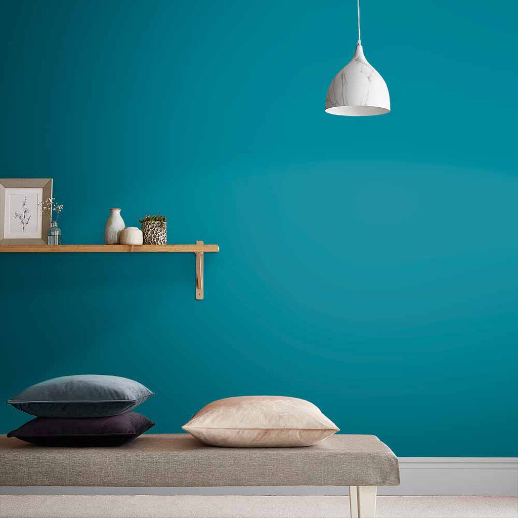
3. Teal the Show
Think tropical oceans, summer skies and a perfect blend of blues and greens, and you have Teal the Show. Repeatedly voted as one of the favourite paint colours for almost any kind of interior, Teal imparts a warmth and vibrancy in any space and works particularly well with rich copper accents in a sophisticated living room or dining room.
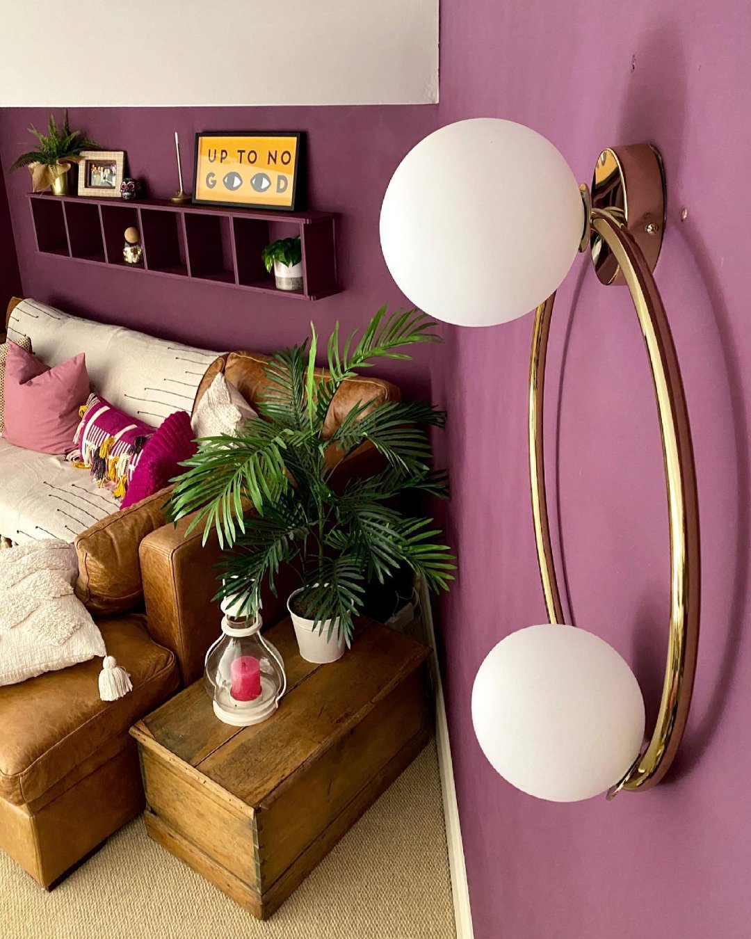
4. Nightshade
Lusciously deep and mysterious, the purple hues of Nightshade are made up of 30% blue pigment to give it a richness you simply cannot match. This colour is associated with opulence, bringing real sophistication to any space. It’s one of Graham & Brown’s ‘Perfectly Partnered’ shades that complements the gloriously indulgent floral motifs of our Allure wallpaper perfectly.
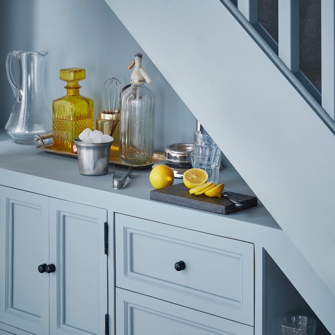
5. Breathe
Voted Colour of the Year 2022, Breathe is a soothing mid-blue with grey undertones that adds colour and depth to any space without overwhelming it. Breathe is suitable for small spaces or large rooms that need a subtle hue to act as a backdrop for a mural wall. Breathe works particularly well with deeper tones as well as metallics for a bolder statement.
6. Dove Feather
So, so subtle and so, so soft, Dove Feather is a peaceful tone that is particularly good for smaller rooms. Dove Feather is surprisingly warm and deep for a neutral wall colour. The blue undertones work well with complementary richer colours and as a base for the occasional surprising pop of primary colour in textiles and soft furnishings.
7. Notte
Notte, or ‘Night’, is a deep, rich navy paint that’s hugely on-trend right now. This utterly mesmerising colour is as deep as the night sky and works perfectly in larger spaces or as a statement wall colour in a medium space. It's bold, it's decisive, but it’s ‘Notte’ for the faint-hearted.
8. Bohemian
The softest hint of pink shines through Bohemian, an eggshell white paint that brings a subtle warmth to any space. This is a pink that complements, not overwhelms, and is a delightful change from the usual neutral tones. If teamed up with statement mural wallpaper, look for accent colours that reinforce the subtle tone of Bohemian.
9. Epoch
Voted Colour of the Year 2021, Epoch is a wonderfully deep burgundy that works really well when paired with softer hues such as lavender as a statement wall colour. This bold colour is a perennial favourite, adding a splash of vibrancy to larger spaces or interest to an alcove.
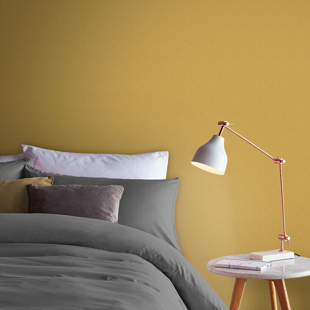
10. Burnt Saffron
Richly indulgent without beingProducttoo ‘blingy’, this gorgeous ochre paint brings warmth and depth to any wall. Mustard paint is a big trend, and Saffron captures that serene glow that brings light to any space. Working particularly well with a dense auburn wallpaper, its vibrancy adds a flash of golden colour to a contemporary interior.
FREQUENTLY ASKED QUESTIONS
WHAT PAINT COLOURS GO WITH GREY?
Grey is a perfect accompaniment to almost any other colour. However, look at the tone of grey you choose and whether it has blue, green or red undertones and select your corresponding wall colour accordingly.
WHAT ARE THE BEST KITCHEN PAINT COLOURS?
Light, bright and airy colours bring a sense of space to a kitchen. Pastel yellows and blues work well in contemporary kitchens, while softer sage greens and burnt ochres suit more traditional farmhouse-style kitchens.
HOW DO YOU DO A PAINT COLOUR MATCH?
Take an accent colour in soft furnishings or furniture or a statement colour in a mural wall and find the closest match to it.
WHAT IS THE MOST POPULAR WALL COLOUR?
Our most popular wall colour in 2023 is Alizarin, and the trend for deep burgundies, auburns and teal seems to be almost unstoppable.
IS WHITE PAINT STILL IN STYLE?
White paint has its place, but colour is back in a big way. Even the softest neutral tones, such as Dove Feather, have a hint of colour rather than pure white's neutrality.